
Home > Directory of Drawing Lessons > How to Improve Your Drawings > Adding Tones and Values > Draw Values and Tones
DRAWING AND PAINTING OF TONES AND VALUES in COLORS, AS WELL AS BLACK AND WHITE
|


|
The text above is made up of images, to copy some text, it is below. HOW TO ADD TONES & VALUES TO DRAWINGSThe word " Value " is often misused. When applied to the art of painting, value is to be understood to mean the relative intensity of one tone compared with another tone, judged by a standard of light. The term is not used exclusively in connection with color, for values are not dependent upon colors. Tones in black and white have values as well as tones in color. Color tones always descend in value from light, the highest, to dark, the lowest, but in engravings or etchings black is sometimes given the high value and white the low. It may be that the engraver, having put more labor into his dark parts than onto the untouched portion of his plate, which prints white, estimates values upon a pecuniary basis. However, the distinction is unimportant so long as we have a predetermined unit, which in these pages will be the dark. While a tone is a definite note in the color scale, the value of a tone depends upon its relation to other tones higher or lower than itself. We alter a color by adding lighter or darker colors to it, but we change the value of the tone by increasing or diminishing its force as compared to its surroundings, for every dark is higher in value than the next darker tone, and every light is lower in value than the next lighter tone. The various colors differ in reflecting power. First comes pure yellow, which reflects the most light ; then, in order, descending the scale—orange, green, red, blue, violet. Therefore, pure yellow has the highest value if compared with other pure colors seen under the same illumination.
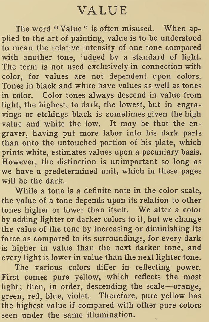
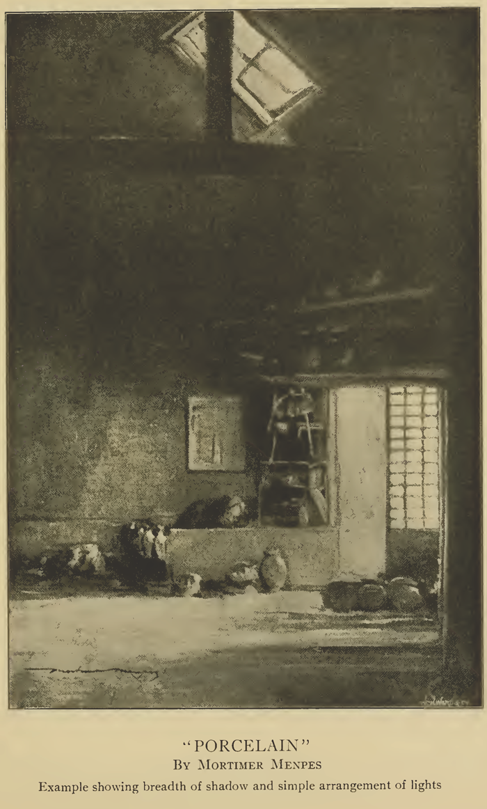
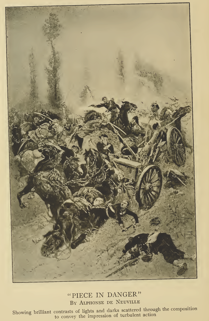
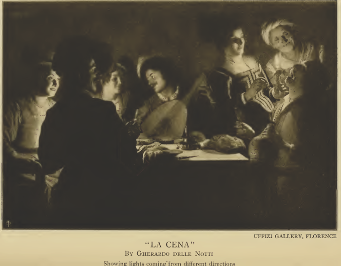
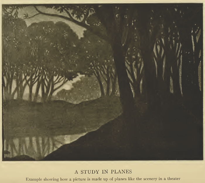
In a painting each object may be given its exact local color, but realism sacrificed to harmony is art. Gradation and concentration are essential in a picture, just as the interest in a drama or a novel is brought gradually to the climax. The value of a tone is enhanced when it is supported by gradually lessening values, whereas, like values detract from one another. A picture is made up of different planes, similar to the scenery in a theater. There is the foreground plane, the middle-distance plane, an extreme-distance plane ; but the number of planes may be indefinite. All things in each plane, however, should have the values consistent. The painter of to-day accomplishes more by the adjustment of values in similar hues than the old masters did by contrasting colors. A greater delicacy and fluency of color is obtained by the modern method. To value a dark red against a dull red is more refined art than painting a blue object on a red background. One scheme results in beauty of color; the other is a matter of contrasts. The values of tones then depend upon the relative amount of illumination they receive. It is not to be understood that a painting is made up of patches of flat tones in the way a decorator handles color. In Rembrandt's paintings, for instance, one can hardly define the area of a tone. While the dominant color in his pictures may be a luminous golden brown, by analyzing it we find the blues, reds and yellows distinct enough, but all skilfully blended together. Sir Joshua Reynolds laid down as a principle that the chief mass of color in a picture should not be a cold tone, but Gainsborough in his " Blue Boy " painted the figure clad entirely in blue, though when examined the blue is seen to be interspersed with warm greens and browns. The complexion of a picture by Corot may be pearly gray, but you will find that he has not obtained it by mixing a quantity of gray color upon his palette and applying it to the canvas. He gets the effect by combining several colors together with deft strokes of the brush upon the work itself. This technique, of course, is representative of advanced painting and hardly within reach of the beginner. The pupil should first learn to see and render tones and their values in masses. The eye as it becomes trained will eventually perceive the more subtle variations. To record the difference in values between a piece of white paper lying upon white snow against a background of white stone will call forth the best efforts of the painter. But herein is the secret of his art. The degree of truth with which he translates such a detail of nature is the measure of his ability. |
Privacy Policy ...... Contact Us