
Home > Directory of Drawing Lessons > Art Principles & Elements > Art Composition > Newspaper Illustrations Composition
How to arrange elements of a picture for better art and drawing composition
|


|
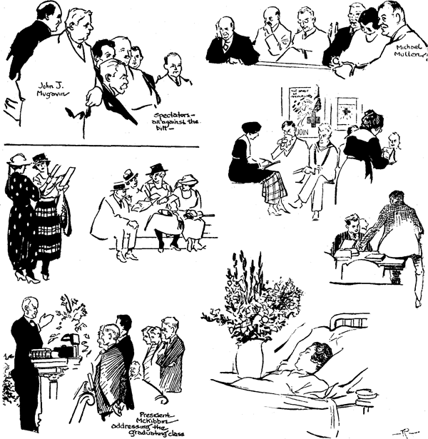
COMPOSITION : Arrangement of the Details in Newspaper Illustrations The newspaper artist should understand the foundation principles of composition — the careful arrangement and grouping of the various elements of a picture in such a manner as to give the drawing a feeling of unity of structure, purpose and design, lines, masses, and colors so placed as to support the main figure or object and at the same time to give the picture balance. Take the accompanying plate, for example — the drawings were made on various news assignments : one at a seminary graduation, another at the deathbed of a youthful suicide, the others at a race track, a meeting of city council, a library desk and Red Cross headquarters. In addition to these small compositions larger portrait sketches were made to go with the original layout in each case. To begin with, color and tones figure prominently in more finished compositions. Perspective also is an important factor. In the first composition, upper left hand corner, note how the heads, which are the subject and center of interest in the composition, are grouped.
The view of this group was drawn at this angle because it offered a better composition than a direct front view would do. Back views should be avoided, particularly on such assignments. Note how the dabs of blank make the composition stand out and catch the eye and carry it to the center of interest, the heads. The rest of the detail of the bodies in a work of this kind is not necessary; The white spaces are filled by placing the lettering so as to aid composition, rather than by merely putting it at the bottom of the drawing. The other top picture, of councilmen, is another view with similar points. In that of the two women glancing over the form sheets (fall garments of 1919 — how styles do change !) note the positions of their heads, hands, bodies and feet. Different color composition — in the headdress and garments adds variety. Again, always choose the view that will make the best composition. This will explain the almost complete back view of the lady on the left. If you cannot avoid drawing a back view and sometimes it is well to show one or more — try at least to get a semi-profile view of the subject's face. Of the two women, note that the subject to the left is closer in vision, thus giving you a problem in perspective that is solved by noting where the top of the head and toes of the subject in perspective touches on a horizontal line with the figure of the foreground subject, keeping the rest in proportion. Also note the gentleman and three ladies on the grandstand steps. Of this group you will readily note that the stout, black-stockinged middle one is the central figure and the center of interest. However, she, is not necessarily in the center of the picture. Details and the body of the first woman (left) are missing, though apparently not missed. Putting all this in would have crowded the composition, and confused and somewhat hidden the point. The scene in the Red Cross office shows a woman recording the misfortunes of ex-service men preliminary to granting them aid. Note how the posters are grouped into the picture to aid the composition, how the dabs of black and other tones help to hold the group together. Otherwise the women would seem to belong to separate, little compositions. The reader will note by the face of the first man that his ailment evidently is of the lungs. The library picture, below, is an interesting back-view pose, permitting a mortise that allows type to be carried into the unused square space of the picture without destroying the composition. Perspective figures conspicuously in this composition. Here again the eye is carried to the main subject (the men) by color rightly placed. The perpendicular side of the table, being a solid black, aids in bringing it more into the foreground than the man seated. His suit is grayer in tone, causing him to recede. In the graduation picture the president, addressing the graduates, was the most important figure of the group, and therefore, with the aid of color, I have centered him in the composition. Perspective is important also in this picture. In placing the men, for example —smaller at the back end than in the foreground—I kept them in proper perspective. Note how the rostrum is worked up—the books and electric light thereon, and flowers, to keep the composition properly grouped. Otherwise it would appear to the eye as one picture of a man talking and a separate picture of a group of men. In fact, if the head of the man in the distance, midway between the graduates, were eliminated, as the picture stands now, it would give the impression of a third group. The position of the lines forming the head is what holds the graduates together. The last composition is that of a suicide, sketched in a Cincinnati hospital. Flowers aid in relieving the somberness of the scene. Note how the flowers and the subject are so handled that the woman retains the interest center of the composition—as also the darkened hair against the white background of the pillow. |
Privacy Policy ...... Contact Us