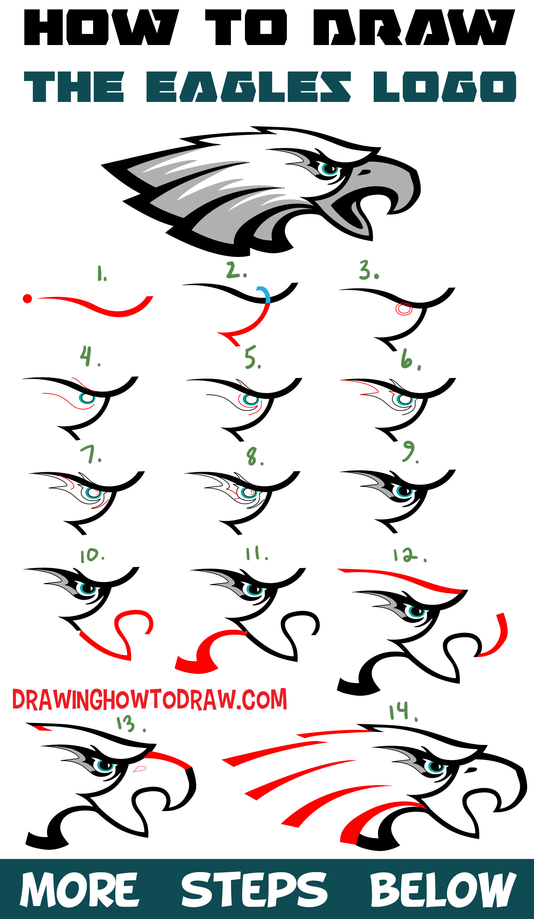
Today I’ll show you how to draw the eagle from The Eagle’s logo. It isn’t too difficult to draw, as long as follow the following step by step instructions. Happy Drawing! Below is a Eagles Vinyl Magnet that gave me inspiration.
Learn How to Draw the Eagle’s Logo with Simple Steps Drawing Tutorial for Beginners
Written-Out Step by Step Drawing Instructions
(Step 1) Draw a sideways “?”-like shape.
(Step 2) Draw a #2-like shape (don’t draw the blue part, just the red part).
(Step 3) Draw 2 circles for the eye.
(Step 4) Draw a sideways “?”-like shape under the eye. Draw a flattened “S”-like curve above the eye.
(Step 5) Draw a few curved lines.
(Step 6) Draw a line and 2 sideways “V” shape.
(Step 7) Draw a “J”-like shape, a “C”-like shape, and a curved line.
(Step 8) Draw a few lines.
(Step 9) Fill in the areas, as I have.
(Step 10) Draw a backwards #2-like shape.
(Step 11) Draw another #2-like shape.
(Step 12) Draw a wavy line above the eye.
(Step 13) Draw a few lines. Draw a “D”-like shape as the nostril.
(Step 14) Draw a bunch of curved lines.
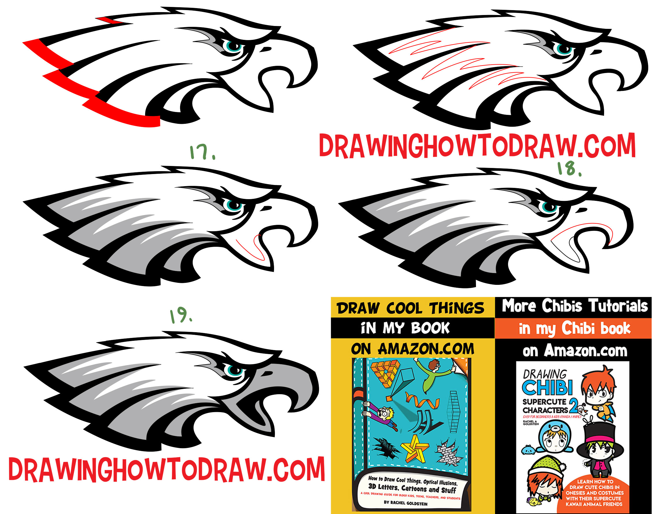
(Step 15) Draw a few more curved lines.
(Step 16) Draw a few sideways “W” shapes.
(Step 17) Color in the feathers at the bottom using the lines you drew in step #16. Draw a backwards #2-like shape.
(Step 18) Draw an upside down “J” shape on the mouth.
(Step 19) Fill in the mouth and beak.
Check Out Our New Chibi Drawing Book on Amazon
Technorati Tags: the eagles, eagles, eagles logo, how to draw the eagles logo
if you want all the steps in one picture, find it below



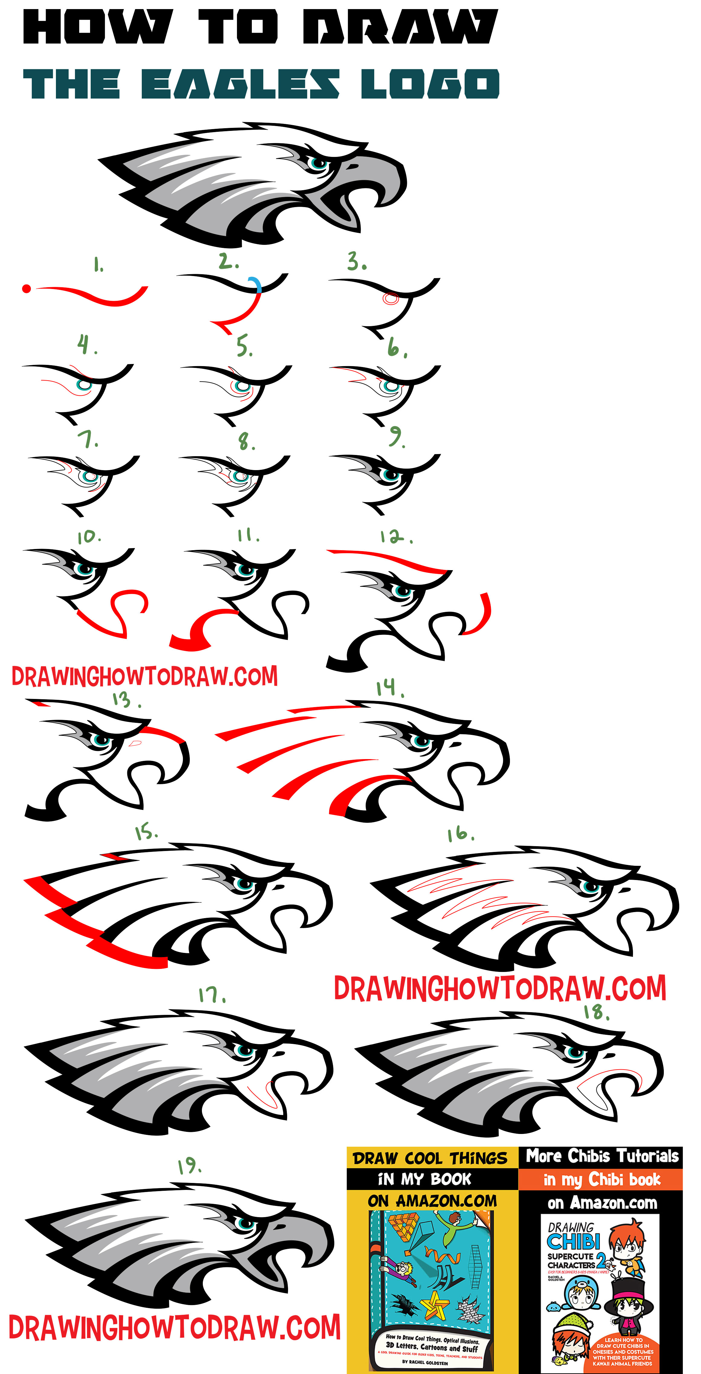
One detail that has to, MUST BE, in the final iteration is the large “E” created by the Eagles feathers which doesn’t happen when the head is flipped and changed. This is what was intended when originally drawn; I don’t really like the new logo as I loved the flying E-A-G-L-E-S and Kelly Green scheme, but there it is..
this was a really cool photo
Hi THis is cool