Ninety percent of your work as a professional cartoonist will have to be done within a panel, so you can see how important it is for you to understand the problems that you will come up against. The panel is your stage and it is your job to put the characters and actors in it. Where and how you place them will have a lot to do with the success of your feature. For the time being, don’t worry too much about backgrounds. For now, we are more interested in the proper placing of the figure in the panel.
Here Are Even More Comics / Comic Strips Drawing Tutorials

Lots of beginners start off by drawing the figure first and then, if they like it, drawing a panel around it and finally the background. This would be swell if you never had to worry about the size or shape of your panel. But cartooning in respect to panels and proportions of panels is an exact art. An editor asks you for a cartoon panel of a certain size. The site he asks for is the size he wants — and he will mark you off his list if you don’t give it to him. Normally you will work larger than the site the drawing is to be reproduced, so you must be sure that the panel will reduce to the size desired. The only way to be sure of this is to scale up your panel to the correct proportions. After checking it, you can start your drawing. Space in a newspaper or magazine is valuable. If you should send a drawing to an editor, and that drawing is the wrong site — say an inch and a half too high — he has two choices. He can throw the drawing away or have it redrawn. If he doesn’t have time for redrawing, he may use your work, but he will be robbing himself of an inch and a half of valuable space that could be sold for advertising. Here’s another reason for learning to draw in a panel frame. If the beginner starts out just drawing any old place he feels like on a piece of paper, he soon becomes accustomed to working that way. When he is given a picture frame and told to draw a figure in it, he doesn’t know how to proceed. The panel frame has a psychological effect upon his sense of proportion. He won’t know where to start drawing the head or the figure. When he does start it, chances are the feet will run out of the bottom of the picture. Drawing is a habit — and for your own future good you should develop, as you go along, habits which will help, not hinder you.

Your panel can show a thousand miles of territory or it can show just the hand of a character. Think of it as a cameraman does in the movies. Before starting to pencil in a panel, decide whether you want a distance shot or a close-up. Most of the time the story you are telling and the action of each individual panel will determine how much or how little you will show. If you are going to show a cowboy being thrown from a hone, you wouldn’t want a close-up of the cowboy’s head; you would need enough distance to show the whole action. If the cowboy is go- ing to wink at a girl, you would want a close-up shot By thinking first, you will save yourself a lot of trouble.
As you will see later on in this lesson, the placing of the figures themselves within the picture frame will in any times set a mood for the over-all scene. This placement of cartoon figures for their mood value is very important to putting over an idea. Many times our daily comic strip of four panel will be best when all the figures in all four panels are placed exactly on the same level. Again, on the very next strip you might find that Panel I will show a full figure; Panel 2 a close-up; Panel 3 a far-distance shot; and Panel 4 another close-up. This is known as “change of pace.” This change of pace is very important and adds color and interest to your work, but be sure there is a reason for it.

Also in this lesson we will take up the procedure for drawing a Sunday page or a daily newspaper comic. The differences between drawing a single panel cartoon and a daily comic strip are quite fundamental. With a single panel cartoon, the artist is more concerned with putting over one individual idea, usually with a wall6p. He is not particularly concerned with what came before or what came after — the whole idea is shown in one panel. The artist drawing the comic strip, on the other hand, is concerned with first putting across his idea — not in one panel, but in a series of panels. He must carry his reader’s interest from the first through to the last panel and at the same time tell his story, both visually and by the use of the balloons.

The panel is your stage
Someone once said that every cartoonist is a frustrated ham actor. Since the average cartoonist usually eats with more regularity than the average actor, the frustration should be easy to control. A cartoonist’s interest in the stage can really be an asset. The panel has its definite limitations — so has the stage. Your job is to present a clear, interesting production within your confined space.
Milton Caniff had a close squeak when he almost became a professional actor after college. Today, his advice to a young cartoonist is apt to be full of stage and movie lingo. The business of stage settings, movie close-ups and long-shots also applies very pointedly to drawings. Caniff’s “Steve Canyon” doesn’t suffer because of his knowledge. Neither will your work.
When we tell you to accustom yourself to working in a panel, we don’t mean just for your finished art work. You should also work in a panel when you are doing practice work. For your practice work on these lessons, rule up a bunch of panels beforehand on your paper. It doesn’t make any difference what size or shape the panels are, just so there is a panel outline to confine you to a given space. Once you have formed the habit of thinking as well as drawing in panels, you will find that you prefer to work inside of panel frames.

::::::::::::::::::::::::::::::::::::::::::::::::::::::::::
CLICK BELOW TO GO TO THE NEXT PAGE : POSITIONING CHARACTERS IN YOUR STRIPS
–~~~~~~~~~~~~–
::::::::::::::::::::::::::::::::::::::::::::::::::::::::::
Position Sets Up The Idea
The way you place figures in your panel and the action you give them will determine to a large degree how fast the reader gets your idea. In these small panels some basic ideas have been set up by the position of the figures, without the use of any words. It it the action that tells the reader what is going on, and to emphasize this point the facial expressions have been purposely omitted.
In and Out of the Panel
Comic figures don’t always stay put. Sometimes you will want to show the figures you draw coming into or leaving the panel —here are some examples of how this is done.


Part of Figures Outside of Panel
When only parts of your characters appear within the panel, it is wise to pencil in the figures completely. This enables you to re late them properly in size and to give more convincing action to the visible portions. Do the same with figures entering or leaving the panel.


::::::::::::::::::::::::::::::::::::::::::::::::::::::::::
CLICK BELOW TO GO TO THE NEXT PAGE : MAINTAINING PORTIONS OF CUT FIGURES
–~~~~~~~~~~~~–
::::::::::::::::::::::::::::::::::::::::::::::::::::::::::
Maintain Proportions of Cut Figures
When you are drawing part of a figure in a panel, you must be sure that the parts shown are in correct proportion to the figure as a whole. Here are two drawings of a man reaching for an apple. In the drawing below, the hand of the man as shown in the Panel couldn’t possibly belong to man seen because his arms couldn’t be that long.


Composition in Comic Strips
In cartooning, composition is used solely to point up your gag or draw attention to the action of your characters in a story. Composition is the tool you use to add clarity to your work, much as re-writing and elimination add punch to your gag or story. You most be aware of it with every line you draw.
Like politics, composition is a subject people can argue about forever and arrive nowhere. There are no hard and fast rules —your composition-sense will grow to be as personal to you as your style of drawing. However, certain things catch and interest the reader’s eye, others repel it. We have tried here to give you a few important fundamentals to start you off.
This is a part of your art that should keep growing with every new picture ‘you draw. Think when you draw: think of blacks and think of’ whites — will this or that line help guide or distract your reader’s eye? If a line or tone doesn’t help direct the eye to the right spot, change it or eliminate it.

::::::::::::::::::::::::::::::::::::::::::::::::::::::::::
CLICK BELOW TO GO TO THE NEXT PAGE : MAKING YOUR COMIC STRIPS INTERESTING
–~~~~~~~~~~~~–
::::::::::::::::::::::::::::::::::::::::::::::::::::::::::
Make it interesting
In today’s competitive market, a cartoonist can’t get very far without imagination. A picture may be drawn with painstaking correctness and still be uninteresting. To be uninteresting is the greatest crime a cartoonist can commit.
When composing your panel, don’t just draw your subject so that it is recognizable. Think: can you include some action or a different viewpoint that will be exciting to the reader’s eye? Perspective, action, background — all the elements of cartooning most be considered as ingredients that can help you make interesting compositions.


Contact points
Confusion in a drawing is had unless your idea deliberately calls for it. If you allow two elements or lines to touch in a picture (such lines are called tangents) you create the illusion that both are the same distance from the reader — although one may be in the foreground and the other in the background. This impair_ the feeling of depth in the cartoon. Accidental points of contact hit the eye the way sour notes hit the ear. The two drawings below show some visual crimes of this type and how to avoid them.


::::::::::::::::::::::::::::::::::::::::::::::::::::::::::
CLICK BELOW TO GO TO THE NEXT PAGE : SPACING YOUR COMIC STRIP PANELS & COMPOSITION
–~~~~~~~~~~~~–
::::::::::::::::::::::::::::::::::::::::::::::::::::::::::
Space
Just as shapes are important to a picture, so is the relationship of space to these shapes. Space is used to show the distance between objects on a Has surface and, more important, to create an illusion of distance. The proper use of space around your figures gives an illusion of depth and also contributes to the mood of the picture.

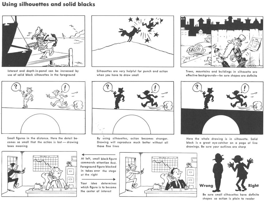
Solid white and solid black
Present-day comic strips are printed so small that it pays to think twice before putting any of that grand old pen shading in your work. It’s apt to close up and look like hair — and hair doesn’t grow on chairs or doorknobs.
Always be alert for chances to simplify your work into solid whites and blacks. For an object to stand out in a composition it must contrast in value with the surrounding area. Solid black is a great eye-catcher, but over-use makes it tiresome. Clean white space is just as powerful. When you draw solid whites and blacks, keep the outlines sharp and clear-cut so that the shapes are easily recognized. Over-shading can ruin your outlines —avoid it.


Laying Out Comic Strip Panels


::::::::::::::::::::::::::::::::::::::::::::::::::::::::::
CLICK BELOW TO GO TO THE NEXT PAGE : DRAWING CARTOONS FOR THE SUNDAY PAPER
–~~~~~~~~~~~~–
::::::::::::::::::::::::::::::::::::::::::::::::::::::::::
The Sunday page
Each syndicate has certain requirements for the sizes and layouts of their Sunday pages which must be kept in mind if you plan to submit work to them. For instance, here is a Sunday “Penny” as it was drawn by Harry Haenigsen in black and white, but scaled down to fit the size of our book.
This, enlarged, would fill a half-page space in the Sunday paper. But, some papers want the feature in one-third page size and the syndicate must supply them. You notice that the entire upper line of drawing with the heading leads into the story, but is not vital to it. This line can be cut off, leaving the two bottom lines — which, with a small type-set heading, would then exactly fit one-third of a newspaper page. Mr. Haenigsen had to keep this in mind as he developed his gag. For the tabloid page size, photo-prints of the drawing are rearranged to make the over-all layout deeper than it is wide.
Usually any good black and white drawing will look well when it is colored. It pays, however, to keep color in mind when drawing Sunday pages. Careful attention to areas of whites and blacks can make a world of difference in the drawing when reproduced in color. Notice how economical of pen shading Mr. Haenigsen is in “Penny,” and how carefully he spots his blacks. This results in good, crisp color reproduction.
In making the printing plates, the engraver works from the master black and white drawing and a color giddy.. This color guide is a photo-stat of the drawing the size it will appear in the paper, and colored with water colors, colored inlOs or aniline dyes. Most syndicates have special artists who do nothing but make the color guides for the engraver and printer. However, some of the top men, Harry Haenigsen and Milton Caniff among them, insist on making their own color guides. The results justify their extra work.
Because of the syndicates’ production costs and the continual battle for space in the color comic pages, a newcomer’s chances of winning acceptance in this field right off the bat are very slim.
The usual procedure is for a cartoonist to build up a good backlog of readership with a daily strip or panel. When the editors feel that the demand is great enough, they will invite him to add a Sunday page to his chores. A number of magazine cartoonists have entered the Sunday comics via this system, but it is usually an invitation-only affair. Very few Sunday pages have leaped into the spotlight full-blown and stayed there.
A sense of color, Iike your composition sense, of which it is a part, is a personal thing which grows with use. As a cartoonist, most of your work will be done in black and white for black and white reproduction, and that is what this course is designed to teach you. But, on that happy day when your editors are ready to spend all that money for four-color plates of your work — be prepared.


Compose for your story
Here are two panels Milton Caniff drew to illustrate this business of composition for cartoonists. In the first he drew the scene in detail, spelling everything out pictorially. In the second panel most of the detail was omitted, leaving just enough to get the idea across. Also, moving the camera right up behind the rifleman’s shoulder puts the reader closer to the action, and gives him that important feeling of participation. Both panels are well composed, but the second is much better for the purpose. The important thing is to add power and clarity to the story. In case your Russian is rusty, the balloon reads: “The Americans
have taken the city — this way!”


Here Are Even More Comics / Comic Strips Drawing Tutorials
Technorati Tags: make comic strip, comic strips, comics, making comics, make comics, comic strip composition, comics layout, drawing comics, draw comics, draw comic strips, lay out comic strip, laying out comic strips, cartooning, drawing funnies, drawing lessons, drawing tutorials, comic lettering, comic letters
Can you tell me the proportions (in Cm) for drawing a daily weekday newspaper comic strip? (Also the bigger Sunday strip)
I don’t know what to do it on???
You might want to buy a large drawing pad, that is what I used to use.