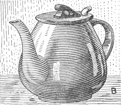
At B we have the teapot, resting on a cloth, with a trifle of tone for background. The teapot, being porcelain, is hard, and a hard, firm line should be used for it; the background is neutral, the cloth soft and a trifle darker. Going over this latter in spots to get a deeper tone, the added lines give a different softer texture, and teapot, background, and cloth are all separated, as much by the difference in the texture of the lines as by the tones which they make and the direction in which they run. It must not be thought that the lines in the teapot were drawn exactly the right thickness first time over, but in thickening them up great care was taken that there should be no irregularities of width or edge.
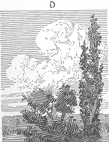
The difference of texture in the lines composing a tint is something that the artist needs to watch continually as in the case of the teapot. Note the little scene in D. The tone of the sky is flat with a smooth, even line; those composing the clouds are broken and give a fluffy appearance, while those in the treetops are strong, heavy, and vigorous. It will be noted that there is a great difference in texture as well as in color and direction between these three parts. As they are now drawn, there is a vast difference in effect between each object in the picture, and each stands out positive, distinct, and with artistic effectiveness. This ability to change the technique and direction of the lines is one of the qualities of the pen, and should be cultivated. It sets this medium apart from every other one, and gives it an individuality and character entirely its own.
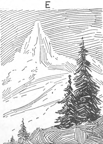
Lastly in E is shown another type of line, light, sketchy, and graceful. There is apparently very little to it, yet it is far more difficult than the other illustrations shown above, because every touch must tell a story every time the pen is put to paper, it must do exactly the right thing, and yet, with all these requirements, the work must be done quickly, easily, and with absolute confidence, or the effect of light grace that is its charm will not be obtained.
In addition to the styles of lining illustrated in the above pictures, there is a type of regular lining that has been carried to a high degree of excellence both for illustrative and other purposes. The different tones are obtained by parallel black lines of varying thicknesses, closer or farther apart as required, every one of which is drawn with care and thought and shaped carefully, is free from any irregularities, and follows the neighboring lines in perfect parallelisms.
Swelled line
In A is shown a square of variable tone, in what is known as a “swelled” line; that is, the line is made thicker, where the tone is to be darker, by “swelling” it. This is done by putting more pressure on the nib, and has to be done very carefully. Beginning at the thin end the pressure is gradually applied, making the black line thicker and the white one thinner. At the heavy end and the lower right-hand corner of the square, as it would be impossible to swell the pen to this extent, the lines are thickened by being drawn over.. It would be almost impossible to draw lines as heavy as these in one stroke, and still keep thin, even white ones between, so the two sides of the heavy black lines are drawn, and then the space is filled in with ink. This has a tendency to make a hard, mechanical line, because both sides of the line are very sharp. It will be noticed, also, that the white lines composing this tint are true in form, and that as the black lines grow evenly thicker, the white ones are evenly reduced in thickness.
The study of an even, regular line tint brings us to the study of the white line. When drawing a tint, an artist is really drawing two lines every time he draws one; namely, the black one in ink, and the white one between it and the last black one. From now on this white space, left between two black lines, must be understood as a white line, and the reader should thoroughly accustom himself to seeing it and understanding it in this way. This is readily understood, but what is not so plain is the fact that this white line (the white paper left between two black lines) is of equal, possibly even greater, importance than the black one. The general tendency in pen drawing is to put in the black line, and to a certain extent ignore the white one, leaving it to take care of itself, depending solely upon the black one for the color and upon crosshatching, etc., to get the darker tones required. This is absolutely wrong, especially where the lining is regular in character, and largely explains the failure of many artists to secure deep, rich tones.
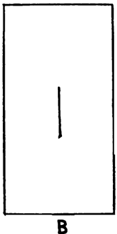
Take a piece of white paper and make a black line upon it, as in B.
and then
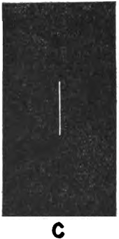
Take a piece of black paper and make a white line of exactly the same thickness upon it, as in C
You will notice that the white line will show up stronger and more prominently than the black line, even though, in reality it is no thicker or heavier. Therefore a few white lines on a black portion of a drawing are of more value in changing a tone than an equal number of black lines of the same thickness on a white part. Because, of all of these facts, it is very necessary that the artist should watch the thickness of his white lines very carefully. When drawing the black one, he must see that the shape and thickness of the white one are taken into as full account. This value of the white line is a fact readily understood in wood engraving, but is not by any means so generally recognized in pen-and-ink drawing, notwithstanding the fact that it is of just as much importance for many reasons.
It is sometimes very difficult, to leave a thin, sharp, white line by drawing around it in black ink. One reason is that a light irregularity of the pen may cause a wavy edge, and, in this case, many artists find it handier to fill in the space solid black, and draw the white lines on top of this black in white, either with a pen or brush. To do this, a heavy, opaque white is needed, one that will flow freely and yet be solid when it is dried. There are several whites made for this specific purpose which answer the requirements perfectly. It is advisable to save a special pen for drawing with white.
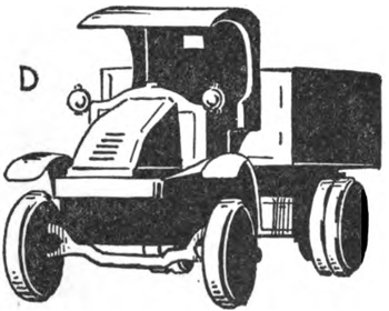
To make this subject of white lining plainer, a truck is shown at D, which, apart from a few short outlines, is all in solid black masses.
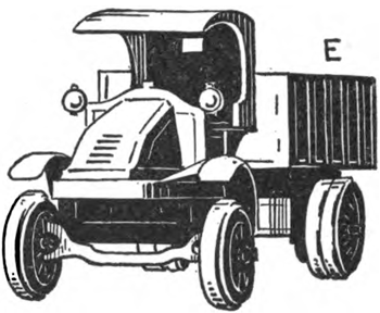
E is a duplicate of the same truck, but with much detail added in the shape of white lines, etc. This truck, E, was drawn in exactly the same way as D; the same outlines, black masses, and so on, and the added work, the lines, detail, spokes of wheels, lines on the side of the hood, on the body, white lines on the seat top, and over the axle, were all drawn with white upon the solid black. This was used in a pen in exactly the same manner as if it had been black ink.
Note : the fact that the lines vary in thickness and distance apart, just the same as if they had been drawn with black ink, and that the black lines also vary in like manner—that is, in thickness and distance.
Once again let us impress upon the reader that it is the combination of black and white lines that form a tint, and that the relative proportion of these to each other will make the depth of color in that tint. It is impossible to make this fact too evident, or to drive it home too strongly, and the fact holds just the same, whether the black lines are drawn on white or the white lines on black.
One of the most difficult things to do in pen and ink, and one that requires both careful work and practice with lines before attempting, is the drawing of a full shaded piece of work without the aid of outlines or sharp definitions between shadows, such as D, but with more complicated detail in tone and quality. A drawing where the tones blend into each other, more or less, where there is much detail or many differences, and yet where these details must not show too hardly or the differences too prominently, is the kind of pen drawing that taxes the artist’s skill to its limit.
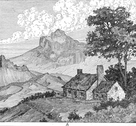
A drawing of this type is shown in A. There is practically nothing in outline, and when an outline has been put in, which is seldom, it is worked into the shadow lines so that it shows as one of them, and not as an outline. This is an exemplification of what has been said before, that one line shows as black; a number of the same lines, as a tint. In a drawing such as A, we are drawing tints and tones, not outlines, varying the style of line to fit the object represented. In the sky, for example, there is a flat tint for the basic blue color of the sky, with the white clouds of an entirely different kind of line floating on it. Then, again, in the ground we have many tones, some of which are fairly dark, some much lighter, but all blending into each other as they do in nature, or simply separated by difference of tonal quality, helped to a great extent by difference of quality or direction of lines composing them. Where there is any sharp distinction of tone it is obtained by the juxtaposition of one mass against another, just as it would be in nature, not by a harshness of line or outline. The trees are somewhat darker in tone than the rest of the work, but they are trees in masses, not in detail, except in places where a small amount of accentuation will help to explain the general composition of the mass.
This is the true secret of pen-and-ink drawing, the drawing of tones and masses, not of lines. The lines are simply a medium for getting the masses, and we must remember that it is the masses we are aiming to draw. The lines are simply the means by which the masses are made. Combination of methods in a single piece of work. Let us consider this drawing in detail, and the means used to place its different phases of tone and quality upon paper with pen lines. The sky background is drawn in parallel lines of an even thickness, an even distance apart, though varying in color, as it approaches the horizon. Upon these the clouds are drawn with a freer, more irregular line, to give an appearance of fluffiness. Against this sky, the hilltop must stand out darker and more massive, and this is drawn in the same style of lining and of varying depths of color and direction. The same lining is used in the middle distance, being changed somewhat in style, according to the requirements of the details in the landscape, or the character of the objects represented. Against this middle distance, the foreground looms up, the side of the hill being drawn in much the same style of line; but the yard within the fence is drawn with a few differences of darker tones and a slight variance of texture by breaking the lines here and there and allowing a white spot to show at the break. The wonderful difference in the appearance of a tone made by this mere breaking of a line shows somewhat plainer in the front of the chimney The thatched roof of the cottage is drawn with more variance in the thickness of the lines, and the same is true of the walls, excepting that the spaces on which the lines change direction are very much smaller. The grass and weeds in the right corner are merely various curved lines run in the manner that such vegetation would fall. In considering the hedges we have a style of lining different from any used heretofore; it is that shown somewhat darker and heavier in the lines, and it will be noticed how this difference in texture and method makes the hedges stand out from the surrounding work. Of course they are darker, but it is not only the tone but also the change in character that sets them apart. This same crosshatching is used in the large tree, only the lines are shorter and, in some of the lighter places, slightly curved. Lastly, the mass of dark foliage back of the cottage was drawn in solid black, and the white lines drawn in with white. The gable end of the main part of the cottage was crosshatched with white.
The drawing of this landscape has been analyzed very thoroughly and in detail, to give an idea of the many ways of drawing lines that will enter into a drawing, not because they may be all absolutely necessary, or because every artist would use the same methods. The style of work mainly used is solely an individual matter, and most artists will have their own individual style, and work accordingly. It is, however, very necessary that all these styles of technique should be understood, so that, when drawing a piece of work, the particular style that seems fitted to any particular part may be grasped at once and used; and this grasping and using should become almost a matter of instinct.
Now you have a good grasping of pen and ink drawing techniques. Start practicing to get your pen lines perfected.
Technorati Tags: pen and ink, pen drawing, ink drawing, drawing in pen, drawing in ink, pen drawing techniques, ink drawing techniques, how to draw, how to illustrate, pen illustration, ink illustration, drawing techniques, how to draw
Today I'll show you how to draw Sosuke and Ponyo in a bubble (chibi /kawaii…
Today I'll show you how to draw a Boo from Super Mario Bros in Kawaii…
Today I'll show you how to draw a cute Anime / Chibi girl holding a…
Today I'll show you how to draw the cute kawaii / chibi bears hugging from…
Today I'll show you how to draw a cute cartoon girl in kawaii / chibi…
Today I'll show you how to draw Taters n Tots characters (cute kawaii dog and…
View Comments
Hi Robert I am one of your fan in art but I am eager to learn to draw with pen art is fun thanks*
I use to draw a lot about 30 years ago, but I became interested in astronomy which took up just about all of my time. Well my doctor says staying out late at night in the damp air is not good for me, and lifting my heavy equipment also is not good for me. So I've decided to give up astronomy and go back to drawing and painting (water colors). This site proved to be just the ticket to get back into art. I am 80 years old but I think I can handle the pen and brush. I did not know that I had become so rusty at drawing. This sote is putting me back on track. I will draw most of the subject matter as it has really helped. Thank you ever so much.
Hi Robert. Sorry to take so long to get back to you. It is never too late to get back into art. It is just what the soul needs to uplift your mood and make life a bit more fulfilling. Glad that my site helped you!!!!
I really like your tutorials and web site. But.... I do find the Draw While You Learn side bar box annoying. I minimize it, but each time I change pages, it comes back up. I think its a useful tool, but keep it minimized until needed.
Hmmmm....that does sound annoying...I will think of a way to stop it from doing that. Thanks for letting me know.
I was looking for something like this on the internet and almost gave up on the matter till i found this!
Thank you! I love you so much =,)